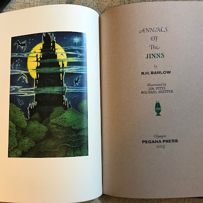
I have really enjoyed getting emails from fellow book collectors who are interested in the process of true old world letterpress printing that we use, so I thought I would spend a moment talking about the latest typeface I purchased for Pegana Press. It is called Goudy 30 and was designed by the prolific craftsman Frederic Goudy. Many of the typefaces we know and see today were designed by him.
Goudy was active designing type from 1894 until his death in the 1940's so obviously he had a profound influence and large window of time to shape the shape of letters in the United States and Europe. In that span he designed easily an amazing number of well-known faces we still use today. Many of them, as he became renowned carried his name as part of the typeface.
I have used Goudy Franciscan for most of our books, including all but the first Lost Tales, Lord Dunsany books. While Goudy could and did design clean, San serif typefaces optimized for readability in newspapers and magazines of the day, his specialty was designing ornate, interesting, and fascinating looking characters for his type. These were increasingly used by publishers and printers looking to give their work a sense of style.
I recently purchased a set of Goudy 30 type from Mackenzie & Harris Foundry who have been casting type continuously since 1915. You may know of them through Arion Press, their sister publisher. and have been using it extensively on Annals of the Jinns and the upcoming King in Yellow edition. I lobbied them incessantly for over a year before they broke down and cast it for me! Here is a brief description of the typeface and its origins, really meant to be his last hurrah as he neared the end of his life.
Goudy Thirty (1953, Lanston Monotype), cut with the intention of being issued after Goudy's death, "thirty" being a newspaper term for the end of the story. Goudy finished work on it in 1942 and Monotype waited several years after his death in 1947 before issuing the font. The font is inspired by 'rotunda', a style of blackletter handwriting popular in southern Europe in the medieval period. Lawson reports that it was not a great financial success for Monotype, as blackletter type was unfashionable at the time, but that Bruce Rogers was a great admirer of the design.
I find it very satisfying to use the tools and craft originally designed by the masters of old in printing Pegana Press books for you. We hope you enjoy them as well!


